Kindle Book Formatting
10 Exclusive Ideas for Amazon Kindle Children’s Book Formatting
Formatting a children’s book for Kindle can be a daunting task, but it’s crucial to make the reading experience engaging, seamless, and visually appealing. Whether you’re an indie author or a professional publisher, the right formatting can make your book stand out. Here are 10 exclusive ideas to ensure your children’s book is beautifully formatted and optimized for Kindle readers.
1. Choose a Fixed Layout Format for Image-Heavy Books
For picture books or those aimed at younger children, a fixed layout is essential. It ensures that images, text, and other elements appear in the exact spots you intended, maintaining the visual integrity of your illustrations and making the reading experience more consistent across devices.- Learn more about Kindle Fixed Layout Formats.
2. Optimize Image Quality and Size
Kindle devices vary in screen resolution and size, which means image optimization is critical. Use high-resolution images (at least 300 dpi) to ensure that illustrations are crisp. However, balance file size by compressing images without losing quality. Kindle recommends that images be in JPEG or PNG formats to ensure faster load times while preserving detail.- For tips on image requirements, visit Amazon Kindle Image Guidelines.
3. Interactive Elements for Enhanced Engagement
Kindle’s HTML5 support allows you to add interactive elements, such as clickable text, buttons, or even small animations. You can create pop-up text for educational content or links to external resources, making learning fun for kids. While these features won’t work on all devices, they can enhance the reading experience on Kindle Fire tablets and apps.- Explore how to add HTML5 and Interactive Content in Kindle books.
4. Use Read-Aloud Functionality
Take advantage of Kindle’s read-aloud feature to provide a multi-sensory experience. You can add an audio narration track to your children’s book, making it easier for younger readers to follow along. This is especially useful for beginning readers who are learning to recognize words as they hear them.- Discover how to incorporate Kindle Read-Aloud into your children’s book.
5. Consider Colour Scheme Carefully
Children’s books often rely on vibrant colours to capture attention, but certain Kindle devices only display in grayscale. When formatting, make sure your images and text look good in both colour and black-and-white. Test your book on various Kindle devices to ensure the colours translate well and the images don’t lose impact.- Read more about Kindle Color and Grayscale Considerations.
6. Custom Typography for a Playful Feel
Fonts play a huge role in setting the tone for your book. Use custom typography to create a playful or whimsical mood that matches your story. However, make sure the fonts are legible on small screens. Kindle allows for embedded fonts, but avoid over-complicated ones that may distract young readers from the content.- Learn how to Embed Fonts in Kindle eBooks.
7. Balanced Page Design with White Space
Young readers can be overwhelmed by cluttered pages. Create a balanced design that includes adequate white space around text and images to improve readability. White space helps focus attention on the key content and gives children time to absorb each page.- Check out tips on Book Layout and Design for children’s eBooks.
8. Use Side-by-Side Text and Illustration Placement
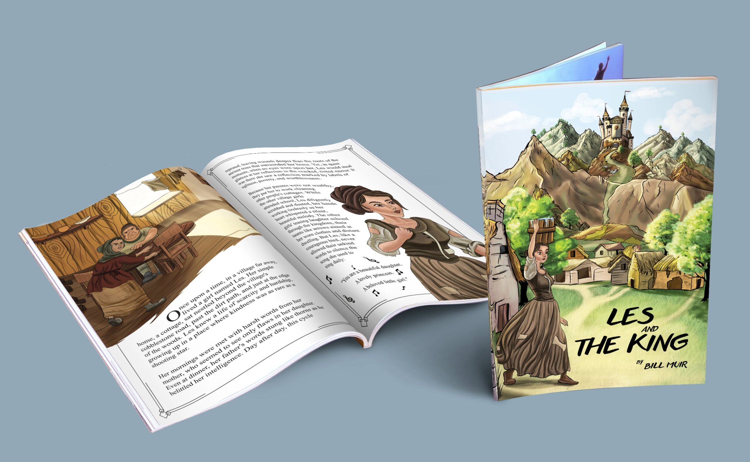
Children’s books often rely on illustrations to complement the text. The best Kindle books for young readers place text next to images on each page, rather than separating them. This alignment helps kids connect the words they’re reading with the pictures they’re seeing, making it easier to comprehend the story.- More information on Kindle Kids’ Book Creator for setting up layouts.
9. Interactive Storyline Choices
Introduce a bit of gamification by allowing readers to choose their path in the story. You can format your book so that certain decisions lead to different plot points. This adds an element of interactivity that’s perfect for Kindle and enhances engagement, especially for older children who enjoy more control over their reading experience.- Learn about Creating Interactive eBooks.
10. Test on Multiple Devices
Kindle readers vary widely—from the Paperwhite to the Fire HD. Before publishing, always test your book on different Kindle devices and apps to ensure formatting consistency. What looks great on a tablet may not translate well to a smaller, black-and-white Kindle. This step ensures a smooth reading experience regardless of the device.- Find the full Amazon Kindle Device Testing Guide.
Conclusion
Formatting a children’s book for Kindle involves more than just inserting text and images. By focusing on layout, interactivity, and device optimization, you can create a delightful reading experience for children and their parents. With these exclusive formatting ideas, your book will not only stand out on Amazon Kindle but also provide a memorable, enjoyable experience for young readers.
No Comments
